

When Stephen Savage was offered the chance to illustrate The Fathers Are Coming Home, by the author of Goodnight Moon, he says, “I couldn’t believe it!” Margaret Wise Brown wrote this story in 1943, and it was discovered after she had passed away. Her hopeful message suggested that families separated by World War II would be coming together again, whether it be a father pig returning to his piglets or a sailor coming home to his child. Now, with American troops in Iraq and Afghanistan, the message is just as important to children today.
How do you work on your pictures?
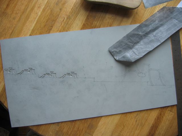
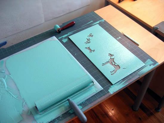
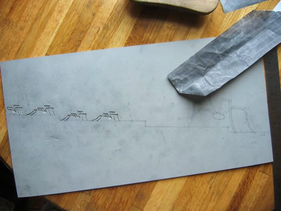
They’re linoleum cuts. There are three steps to a linocut illustration:
1. Drawing. Figure out what the drawings are, then transfer the drawing to pieces of linoleum.
2. Cutting. Take a linoleum cutter, and do a relief print. That means you carve out the areas of the block that aren’t going to print ink. The areas that are left standing – that’s the printing part.

3. Inking. Next, I ink the blocks with water-based ink on a roller. Quickly, before the ink dries, I lay a piece of paper on top of the block. I use a wooden spoon or my fingers to press the paper down.

The trick is you have to figure out which colors will go down first. I do one color at a time on one block at a time. Here Stephen Savage discusses his process:
How do you choose which color to use first?
In the ocean liner spread, I did the lightest colors first, so I started with the turquoise. The very last block is the little tiny red bottoms of the smokestacks.
But the ocean seems to change color beneath the ocean liner.
That gradated light is just done with a roller: you use a dark color on one side of the roller and the lighter one on the other. That’s the way the Japanese woodcutters did it. It’s a way of creating dimension on an otherwise flat piece of art.
The fish babies also change colors as we move further back in their V-shaped formation.
In that spread, the first color that went down was the dark blue. Then I went with lighter colors on top of the blue. When the light colors go on top of the dark colors, they crackle in a nice way. You have to do a bunch of versions to make sure it works. I threw away 5 prints on that one.
You often repeat colors. Why?
I knew I wanted to have aqua at the beginning and the end and then throughout to tie the book together. You don’t want to overwhelm the viewer with too many colors. I do a color script–tiny images of the book that I put all together on one sheet of paper. Readers only see one picture at a time, but a pattern does register.
We liked the way the piglets’ reflection shows in the mud.
I thought the reflection would make the mud look more serene. You don’t want it to look like oil or something. I did a lot of research on pigs. Our little girl is 15 months old, and we went up to the petting zoo in Woodstock, NY. Pigs are like dogs, they’re super friendly. We walked over to the pen, and I thought, “I don’t want to touch the pig,” but their skin is nice! They’re hairy, but it’s like petting a dog.
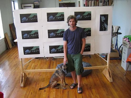
Stephen Savage in his studio:


I think I will try this with my children’s grandparents.
What a wonderful find to have this book by Margaret Wise Brown at such a perfect time in our history. I enjoyed learning about the illustration process. Beautiful work.